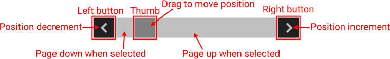
ScrollBar
Description
This Widget can be used with List and Grid Widget for scrolling within large lists that do not fit entirely within said Widgets. If width > height then a horizontal ScrollBar is displayed:
… and if width <= height then a vertical ScrollBar is displayed.

The horizontal ScrollBar has left and right buttons, and the vertical top and bottom buttons.
This Widget connects to the List or Grid Widget via a variable of type struct:$ScrollbarState which is set in the Data property. The structure struct:$ScrollbarState has these fields:
numItems– how many items/elements are in the listitemsPerPage– how many items fit inside theListorGridWidget.positionIncrement– determines how many items we will move within the list when the left/top button (shift to the left/up) or the right/bottom button (shift to the right/down) is selected.position– the position of the first item/element that is rendered in the list. So within theListorGridWidget, items frompositiontoposition + itemsPerPagewill be rendered.positioncan be in the interval from0tonumItems – itemsPerPage.
The scrollbar can change its `position’ in the following ways:
- By selecting the Left/Top button
positionis decreased by thepositionIncrementvalue. - By selecting Right/Bottom button
positionis increased bypositionIncrementvalue. - By moving the thumb
positionis set to a value in the interval from0tonumItems - itemsPerPage. - If the region between the Left/Top button and the thumb is selected, then the position is reduced by
itemsPerPage(AKA “page up”). - If the region between the thumb and the Right/Bottom button is selected, then the position is increased by
itemsPerPage(AKA “page down”).
Properties
Specific
-
Data
EXPRESSION (struct:$ScrollbarState)
-
Set here the name of the
struct:$ScrollbarStatetype variable. -
Left button text
String
-
The text that will be displayed inside the left/top button. Usually a single character from an icons font is used.
-
Right button text
String
-
The text that will be displayed inside the right/bottom button. Usually a single character from an icons font is used.
-
Visible
EXPRESSION (boolean)
-
If the calculated expression is true then the Widget is visible, and if it is false then the Widget is hidden. It can be left blank, in which case the Widget is always visible.
Position and size
-
Resizing
Any
-
If the page where this Widget is located has the “Scale to fit” option enabled, then this option can be used to control how the position and size of the widget will be calculated when scaling the page:

With the Pin to edge option we can fix the top, right, bottom and left edge of the Widget in relation to the page when it changes its original dimension because the Scale to fit option is selected. E.g. if we selected Pin to top edge then the distance between the top edge of the page and the top edge of the Widget will always be the same, in other words the Top position does not change the value. If Pin to top edge is not selected, then the Top position will scale proportionally as the page height scales.
Using the Fix size option, we can fix the width/height of the Widget, i.e. if this option is selected the width/height will always be the same, and if not selected the width/height will scale proportionally as the page height scales.
Note: If Pin to left edge and Pin to right edge are selected, then the Fix width option will be disabled, and conversely if Fix width is selected, then both Pin to left edge and Pin to right edge cannot be selected, because both cannot be satisfied. The same applies to Pin to top edge and Pin to bottom edge and Fix width.
-
Hide “Widget is outside of its parent” warning
Boolean
-
Check when we want to hide “Widget is outside of its parent” warning message(s).
-
Left
Number
-
X position of the component in relation to the page or parent widget. It is set in pixels.
Hint: when setting the value of this property (as well as the
Top,WidthandHeightproperties), simple mathematical expressions can be used. When we enter an expression and press enter, the expression will be evaluated and the result set as the value of this property. It is allowed to use+,-,*and/operators in expressions. Brackets can also be used.Examples of such mathematical expressions:
18 + 36,50 + 32 * 6,(100 - 32) / 2. -
Top
Number
-
Y position of the component in relation to the page or parent widget. It is set in pixels.
-
Width
Number
-
The width of the component. It is set in pixels.
-
Height
Number
-
The height of the component. It is set in pixels.
-
Absolute pos.
String
-
The absolute position of the component in relation to the page. This property is read-only.
-
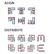
Align and distribute
Any
-
Alignment icons and component distribution. Alignment icons appear when two or more components are selected, and distribution icons appear when three or more components are selected.
-
Center widget
Any
-
Icons for horizontal and vertical centering of widgets within a page or parent widget.

Layout
-
Tab title
EXPRESSION (string)
-
If this widget is a child of a container with layout set to
Docking Manager, use this property to set the title of the tab that contains this widget.
Style
-
Default
Object
-
Style used when rendering the background of the Widget.
-
Thumb
Object
-
Style that will be used to render the scrollbar thumb.
-
Buttons
Object
-
Style used to render the left and right buttons.
Events
-
Event handlers
Array
-
List of event handler definitions. During execution, the widget can generate certain events (e.g. the
CLICKEDevent is generated when the touchscreen is pressed and released within the Widget) and through this list we can specify the method of event processing. We must define these properties for each event handler:Event– Event that is processed, e.g.CLICKED.Handler type– There are two options:FloworAction. IfFlowis selected, a flow output will be added through which the event is processed, and ifActionis selected, then it is necessary to specify which User action will be performed during event processing.Action– If theHandler typeis set toAction, then here we need to enter the name of the User action that will be performed during the processing of the selected event.
Flow
-
Inputs
Array
-
Additional component inputs that the user can add as desired in order to use them to receive additional data needed when evaluating expressions in properties. Each input is given a name and type. Name is used when referencing an input within an expression. A type is used to project Check to check whether a data line that transmits data of that type is connected to the input or not.
-
Outputs
Array
-
Additional component outputs that the user can add to send data through. Each output is assigned a name and type. An example of using this output is e.g. in the Loop component, where we can put the output name for the
Variableproperty instead of e.g. variable name. In that case, the Loop component will not change the content of the variable in each step, but will send the current value through that output. -
Catch error
Boolean
-
If this checkbox is enabled then an
@Erroroutput will be added to the component and if an error occurs in this component during the execution of the Flow, the Flow will continue through that output. The data that will be passed through that output is the textual description of the error.
Examples
- eez-gui-widgets-demo