P9. Styles and Color themes
P9.1. Overview
Styles make it easy to define a whole range of visual attributes and unify the appearance of widgets.
Style attributes can be set at multiple levels, i.e. there are multiple scopes.
The base level/scope is Local: all style attributes will only apply to that Widget. When we want to use the same style on several Widgets, we can use the Project style defined in the Styles panel.
By using Project styles, instead of local style modifications, consistency is achieved (Widgets of similar purpose have the same visual appearance) and sustainability (a change to an attribute in a Style used by multiple Widgets is automatically propagated to all Widgets that use it).
Style attributes are inherited, which means that one attribute of a Style can inherit attribute from another Style. i.e. the Child style inherits all properties of the Parent style.
Additionally, all style attributes that contain a color definition can inherit the color from the Color Theme as explained in Section 9.4.2.
P9.2. Style properties
Fig. 1 shows how for the selected widget (1) the locally defined style parameters can be found in the Style subsection (2) within the widget Properties panel.
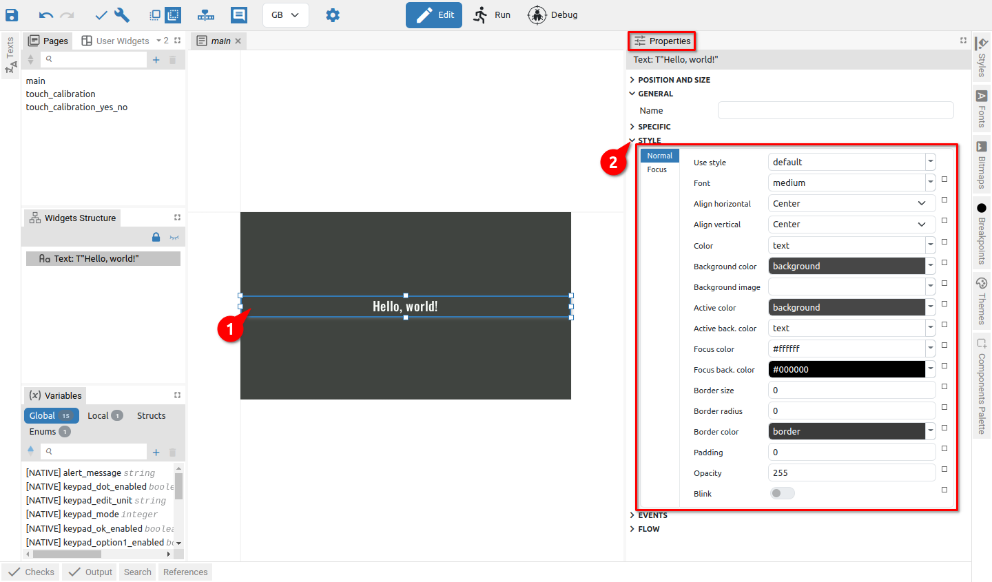
Fig. 1: Selected widget Style section for EEZ-GUI project type
The number of attributes and the appearance of the Style section depends on the project type in which the widget is used. In Fig. 1 the Style section for the EEZ-GUI project type is shown. Fig. 2 shows an example of the Style for the Button widget in the Dashboard project, and Fig. 3 example Style for Label widget in LVGL project.
The number of style attributes varies by Widget type and Project type. Widgets that can have multiple states (Default, Focused, Disabled, …) will be able to define style attributes separately for all states.
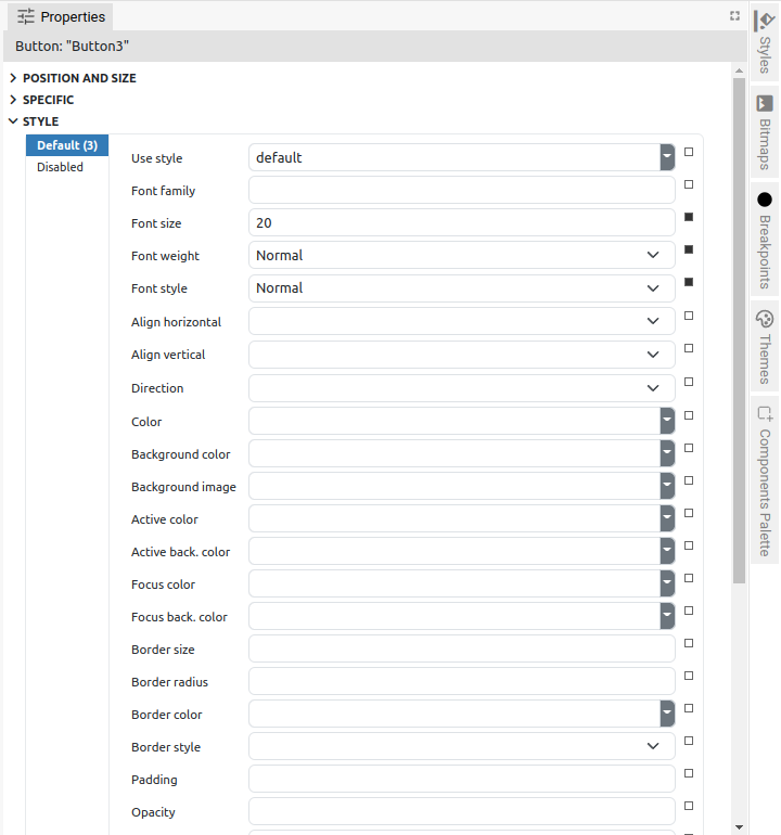 Fig. 2: Style properties (Dashboard project)
|
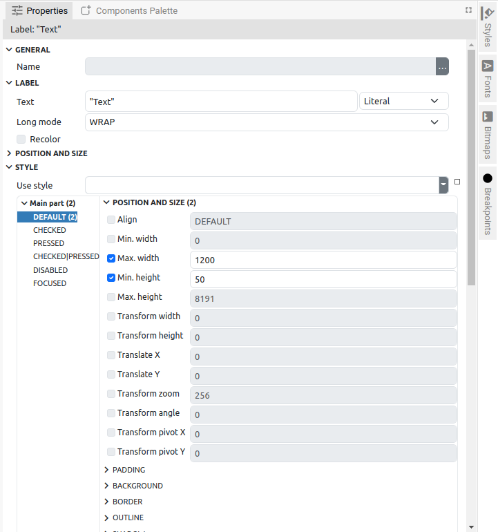 Fig. 3: Style properties (LVGL project)
|
P9.3. Project Styles
As shown in Fig. 1, Project styles have their own panel (1) where they can be searched, added and deleted. For the selected Project style, all properties will be displayed in the Properties panel, i.e. the same one used to display Widget and Action properties (5), and the name of the selected Style is displayed at the top (4).
Below the list of Project styles, a preview is shown. EEZ-GUI project styles have two previews: the first when Color / Background Color is used (2), and the second when Active Color / Active back. color is used (3). In Fig. 5 the preview section for the LVGL project is shown (6).
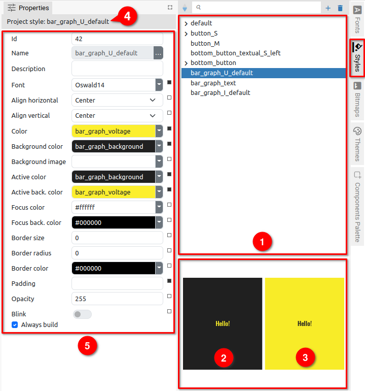 Fig. 4: Project Style Panel and Properties
|
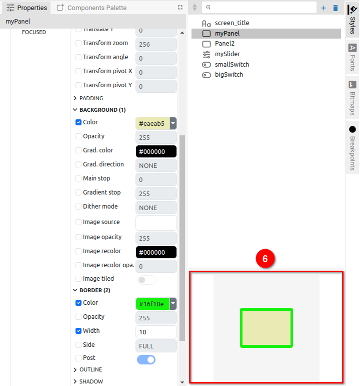 Fig. 5: LVGL Project style
|
P9.3.1. Creating a new Style
When creating a new Project style, it will be necessary to define the Name (Fig. 6) that must be unique. In the LVGL project, it will be necessary to choose for which Widget type it will be applied (Fig. 7).
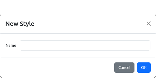 Fig. 6: Adding a new Style
|
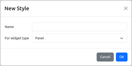 Fig. 7: Adding a new Style (LVGL)
|
A new Project style can be conveniently created directly from the local style of the selected Widget using the Create New Style option from the popup menu of the Use Style attribute (Fig. 8).
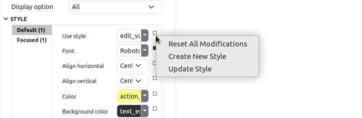
Fig. 8: Add new Style from currently selected Widget
|
Item |
Description |
|
Reset All Modification |
Resetting (clearing) all local changes. |
|
Create New Style |
Creating a new Project style using the style settings of the currently selected Widget (opens a dialog box for creating a new Project style as in Fig. 6 or Fig. 7). After successful creation of the Style, it will be assigned to the selected Widget, too. |
|
Update Style |
The Project style used by the Widget will be updated with local modifications. Therefore the local modifications will be applied to all other Widgets that use the same Project style. |
P9.4. Style hierarchy
Project styles can inherit properties, so a "child" style inherits all the properties of its "parent". The "Child-parent" relationship is shown in the Project style sheet, where changing the position sets or resets the "child" relationship. Inheritance can be multi-level, i.e. one "child" can become the parent of another "child". For example, in Fig. 9 Style edit_value_active_M_center has two child Styles (1): edit_value_active_S_center and edit_value_active_M_left. Child edit_value_active_S_center is the parent of two other child Styles (2): icon_and_text_S and edit_value_active_S_center_icon.
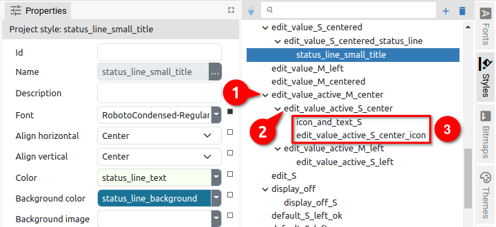 Fig. 9: Styles hierarchy
|
 Fig. 10: Styles hierarchy in LVGL project
|
Since the Project styles in the LVGL project also have a Widget type defined, it is possible to establish a "child-parent" relationship only between styles for the same Widget type. For this reason, in the Style Panel of the LVGL project (Fig. 10), an icon of the Widget type is displayed (4) in addition to the name of the Style, so that there is no need to guess whether the selected Style can become a child of a certain Parent or not.
Setting the Style as child is easily achieved with drag & drop as shown in Fig. 11: click and hold the Style you want to become a child (1): drag to the Style that will be the parent until the navigation line appears (2). Move the cursor to the right so that the beginning of the line is indented relative to the name of the parent Style. Finally, make drop and Style will appear indented and below its parent (3).
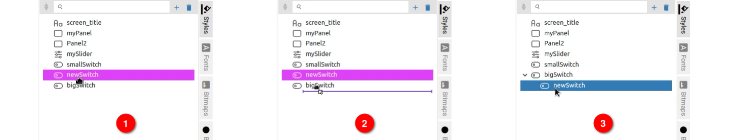
Fig. 11: Set child Style position
Resetting the child position is also carried out with drag & drop as shown in Fig. 12.
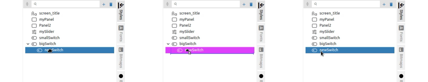
Fig. 12: Reset child Style position
P9.4.1. Setting the Style attribute color from the palette
A style can contain multiple attributes that define the color of a Widget part. Setting the color can be done in two ways and the first is by using the Color picker.
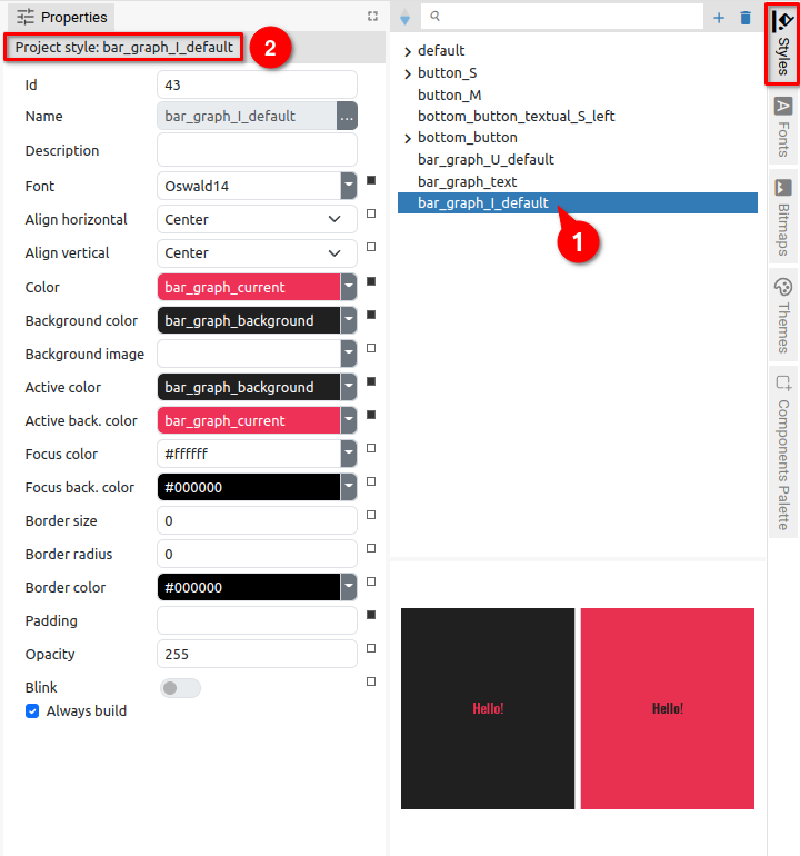 Fig. 13: Selecting a Style in the Style panel
|
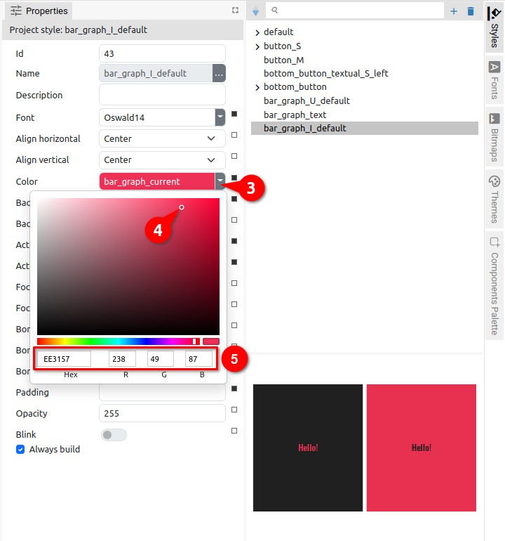 Fig. 14: Setting the Style attribute color
|
In Fig. 13 and Fig. 14 shows how it can be done for the Project style: the style should be selected in the list (1) when its name will appear in the Properties panel (2). The attribute to which we want to set the color should be clicked on (3) to open the Color picker. By moving the cursor around the palette, we select a color whose hex and RGB value is simultaneously displayed in the lower section through which it is also possible to directly enter the desired hex or RGB value.
P9.4.2. Setting the Style attribute color using the Color theme
Another way to set the attribute color is by using the Color theme. The color theme must be selected from the Theme panel (1) and in the Styles panel select the Project style to which we want to set the color attribute.
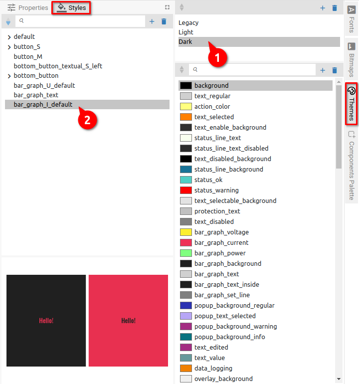 Fig. 15: Selecting a Style in the Style panel
|
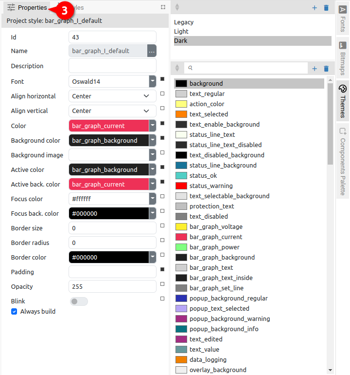 Fig. 16: Displaying the properties of the selected Style
|
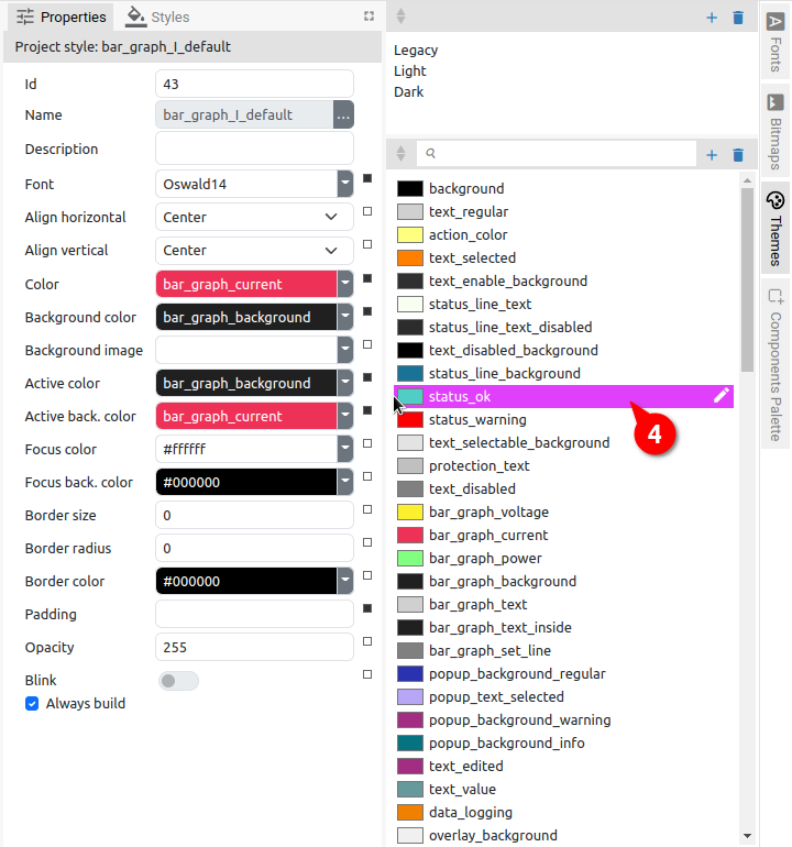 Fig. 17: Selecting a color from the Color theme
|
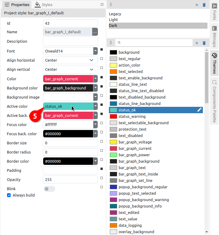 Fig. 18: Changing the color of the Style attribute
|
Now we need to select the Properties panel (3) in which all the attributes of the selected Style will be displayed. In the Theme panel, select the color (4) that we want to assign to the Style attribute and use drag and drop to place it in the name field of the attribute (5).
The attribute color can also be set by entering the name of the color from the Color theme, in our example it would be status_ok.
P9.5. Style attributes
P9.5.1. EEZ-GUI project
In Fig. 19 shows a LineChart widget that has several style definitions: Normal, Title, Legend, X axis, Y axis and Marker (1). The first attribute Use style (2) determines from which Project style the attributes will be inherited and it can be defined separately for each of the style definitions.
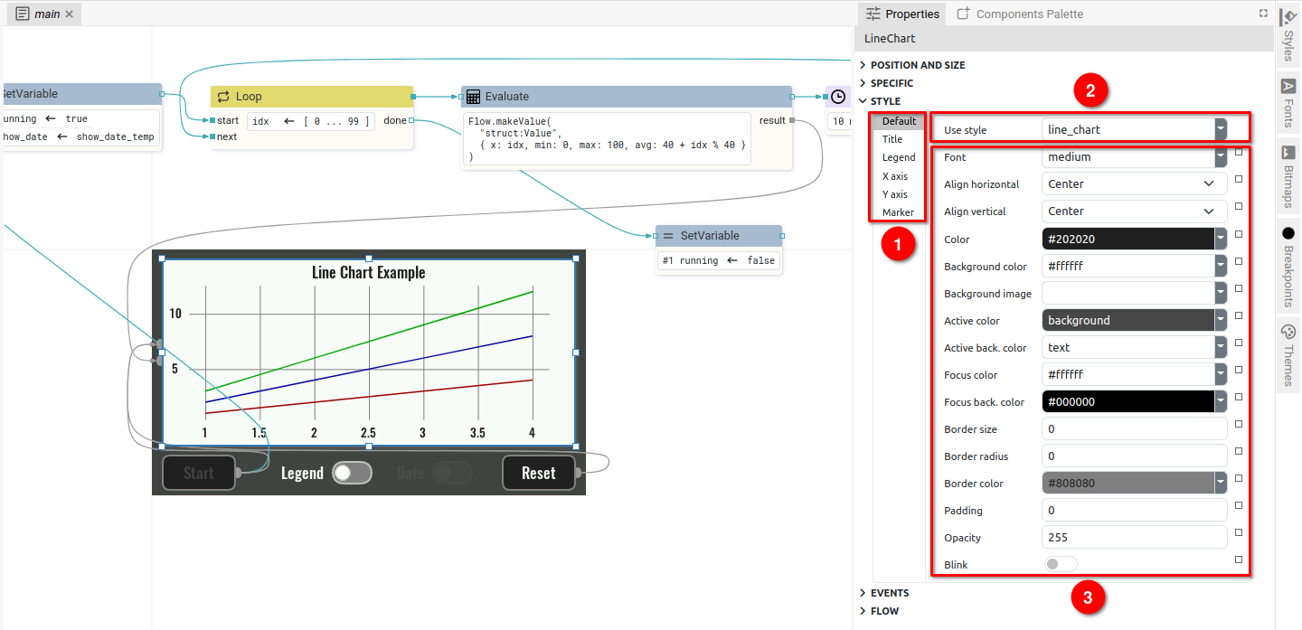
Fig. 19: EEZ-GUI project local Style attributes
Changing the Use style immediately propagates the attributes of the selected Project style to the corresponding attributes of the widget (3). All attributes listed below that contain a color value is either a hex color definition (e.g. #4beef2) or a color name as defined in the Color theme.
|
Item |
Description |
|
Use style |
The name of the Style from which this widget inherits style attributes. If there is some locally modified attribute then it has precedence over this style definition. This attribute can be left empty, which means that this widget doesn’t inherits any attribute from other Style and only local settings are used. |
|
Font |
The font for the texts displayed inside this Widget. |
|
Align horizontal |
Horizontal text alignment. |
|
Align vertical |
Vertical text alignment. |
|
Color |
The color of the text. |
|
Background color |
The background color of the Widget. |
|
Background image |
The background image of the Widget. |
|
Active color |
The color of the text when Widget is active. For example:
|
|
Active back. color |
The background color of the Widget when it is active. |
|
Focus color |
The color of the text when Widget is in focus. |
|
Focus back. color |
The background color of the Widget when it is in focus. |
|
Border size |
The line width used to draw the border. |
|
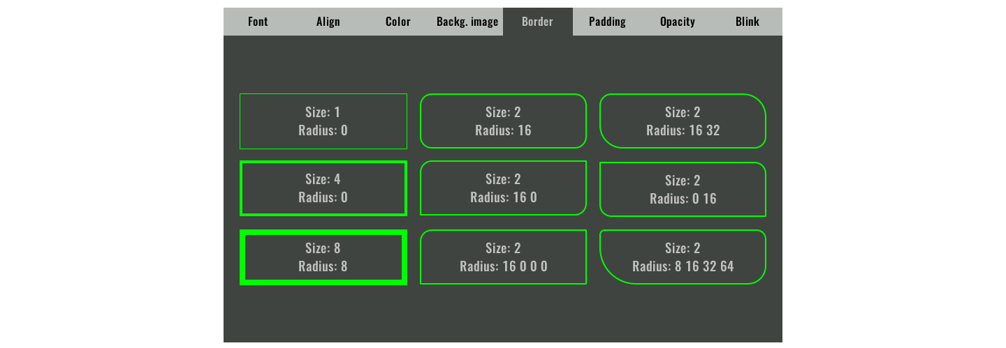
Border radius |
The radius of the border corner. It can be given as 1, 2 or 4 numbers separated by a space, with the following meaning:
|
|
Border color |
The color used to paint the border. Below are examples of different borders: |
|
|
|
Padding |
The offset of the text. It can be given as 1, 2 or 4 numbers separated by a space, with the following meaning:
|
|
Opacity |
0 – fully transparent, 255 – fully opaque. |
|
Blink |
If enabled, the Widget periodically switches between Normal and Active State. Use different normal and active colors to achieve blink effect. |
P9.5.2. Dashboard project
Dashboard project styles are based on CSS styles: https://developer.mozilla.org/en-US/docs/Web/CSS
The Use style attribute has the same function as in the EEZ-GUI project.
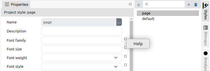
Fig. 20: Style attribute help
For each Style attribute, there is a Help link (Fig. 20) to open the corresponding help page for CSS properties on Mozilla’s website. You can consult the CCS documentation for an explanation of the following attributes:
- Font family
- Font weight
- Font style
- Align horizontal
- Align vertical
- Direction
- Color
- Background color
- Background image
- Active color
- Active back. color
- Focus color
- Focus back. color
- Border size
- Border radius
- Border style
- Padding
- Opacity
- Box shadow
Use Blink attribute (1) to achieve Widget blinking (Fig. 21). The generated CSS can be checked in the CSS preview (2) when this attribute is enabled. Use Additional CSS section to enter any custom CSS properties (3).
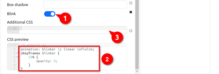
Fig. 21: Dashboard style blink attribute
In CSS preview, which is a read-only section, there is a summary of the all CSS properties generated for the Style, including parent styles and local modifications (commented as /* inline style */).
P9.5.3. LVGL project
Style definition in LVGL project are grouped in Parts, States and Categories. Each Widget type can have different Parts which can be differently customized with the Styles.
In the example from Fig. 22 Slider widget shown has three different Parts: Main, Indicator and Knob (1). For each Parts, it is possible to separately define the attributes of six possible States: Default, Checked, Pressed, Checked|Pressed, Disabled and Focused (2). Finally, for each State it is possible to define 72 attributes that are grouped into 11 Categories i.e. Position and Size, Padding, Background, … (3).
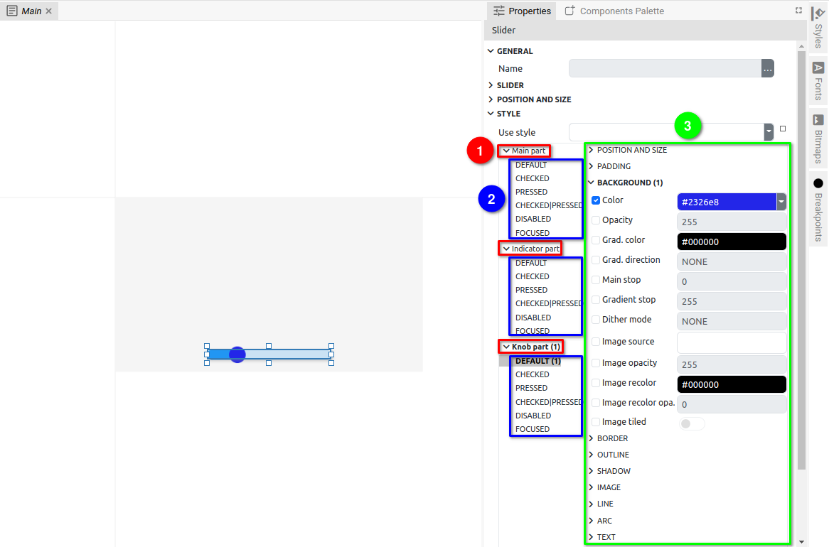
Fig. 22: LVGL project local Style attributes
Unlike the EEZ-GUI and Dashboard projects, LVGL Style attributes are changed by checking the checkbox to the left of the attribute name.
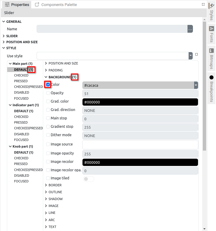
Fig. 23: Indication of modified attributes
In the category name, state name and part name there is an indication how many properties are changed (Fig. 23).
You can find out more about LVGL widget styles on the official pages of the LVGL project: https://docs.lvgl.io/latest/en/html/overview/style.html.
In the subsection https://docs.lvgl.io/latest/en/html/overview/style.html#properties there is a list with explanations of each attribute (i.e. properties).
P9.5.4. Inheriting local Style attributes
In Section 9.3.1. it was mentioned that local style can be used to create Project style (which can be assigned to other Widgets). Likewise, Use style is used to set a local style from the list of Project styles defined through the Style panel (Fig. 24). In the case of an LVGL project where the Project style refers to a specific Widget type, a list of only those Project styles for the corresponding Widget type will be displayed (Fig. 25).
In addition to the selection from the list, the style can also be set by directly entering a valid name (case sensitive).
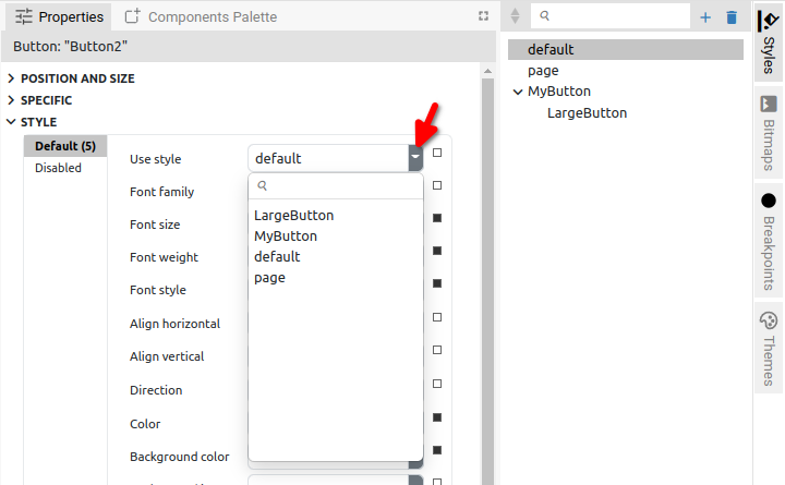 Fig. 24: Set a style from the Project style list
|
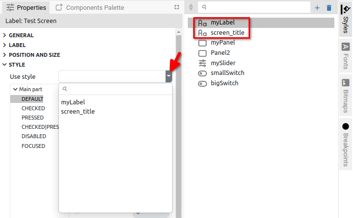 Fig. 25: Set a style from the Project style list (LVGL)
|
In the EEZ-GUI and Dashboard project type, on the right side of each attribute there is an indicator whether the attribute has been locally changed (filled square, see Fig. 26) or not (empty square). In the latter case, the name of the Project style whose attributes it inherited will be displayed at the mouse hover (Fig. 27).
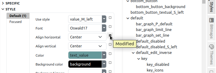 Fig. 26: Modified Style attribute indication
|
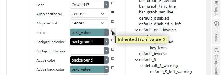 Fig. 27: Inherited Style attribute indication
|
An attribute that has been changed can be reverted to the original value it inherited from the set style. For this, it is necessary to select the Reset option from the popup menu on the indicator (Fig. 28). In case the attribute defines a background color, an option to set a transparent background will also appear in the menu as shown in Fig 29.
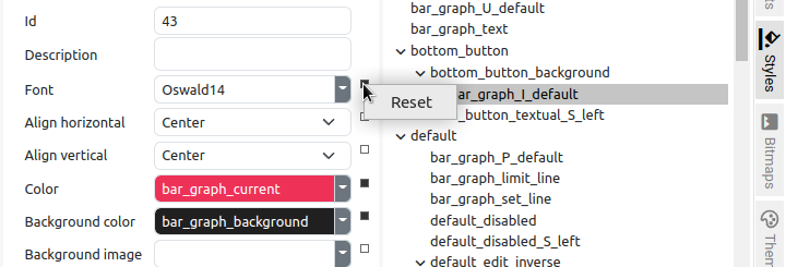 Fig. 28: Reset local style modification
|
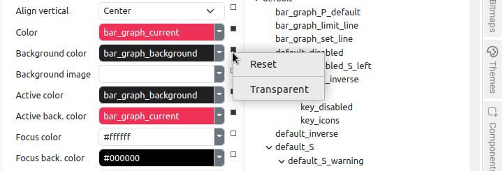 Fig. 29: Reset local style modification (Background)
|