P2. Projects editor
This chapter provides an overview of the basic elements and functions of the Project editor. Their detailed description and content is described in other chapters.
P2.1. Project editor workspace
Fig. 1 shows a typical arrangement of Project editor elements. Thanks to its modern design, the Project editor offers users the freedom to rearrange them according to their own needs and taste.
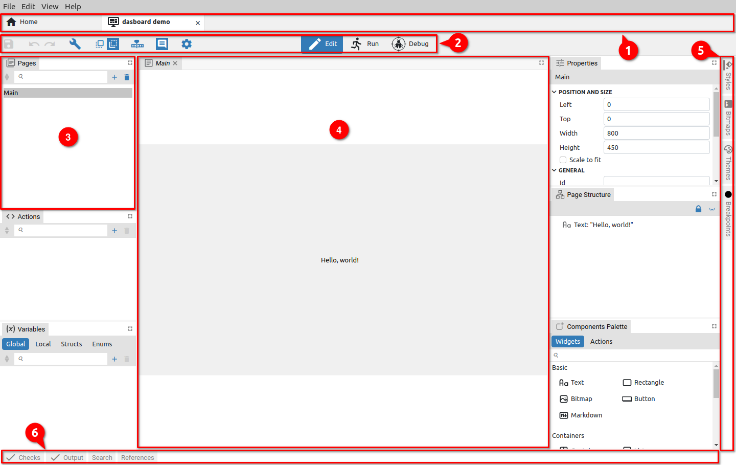
Fig. 1: Project editor sections
All elements of the project editor can be classified into three main groups:
- Toolbar – contains icons of basic editor functions, the number of which varies depending on the type of project.
- Panel windows – can contain groups of project elements, components and reports e.g. Pages, Actions, Styles, Fonts, Bitmaps, Variables, Checks, Output (Build results), Search and References. Panels can be grouped within a tabset when they are accessible via tabs labeled with their names.
- Page editors/viewers is used to display the page being edited (Page editors in Debug mode are Page viewers because then the content of the page cannot be edited).
Panels and editors can be grouped within one or more tabsets. Tabsets are dockable and can be placed in the workspace e.g. (3) and (4) or along borders e.g. (5) and (6). The elements of the project editor shown in Fig. 1 are explained below.
|
# |
Section / option |
Description |
|
1 |
Main tabs |
Allows easy navigation between multiple open projects (as well as other options that do not belong to the Projects section, i.e. instruments, etc.). |
|
2 |
Toolbar |
List of the main functions of the Project editor and modes (Edit, Run and Debug). |
|
3 |
Tabset |
A dockable section that contains one or more panels. |
|
4 |
Editor tabset |
The place where Pages and Actions are edited. Unlike Actions, Pages also contains GUI elements (Actions can only contain program logic created in EEZ Flow). |
|
5 |
Right border tabset |
An example of a border tabset placed along the right border. By default, it contains panels for styles, bitmaps, themes and breakpoints. |
|
6 |
Bottom border tabset |
An example of a border tabset placed along the bottom border. By default, it contains panels for error checking, build and search lists. |
P2.2. Display of the page in the editor
In Fig. 2 shows how it is possible to work with multiple editors. To display a page in the editor, click on the desired page (1). A new editor tab will appear, with the name of the selected page in italics (2). This indicates that the tab is not locked and if you choose another page from the list, it will replace the currently displayed one. If we want to lock the page, we will use the right click when the option Keep Tab Open (3) will appear. When the page is locked, its name will no longer be displayed in italics (4).
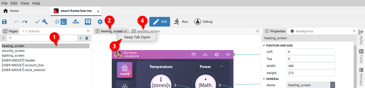
Fig. 2: Page editor tab locking
P2.3. Panel moving and docking
Panels and editors can be freely positioned within the workspace or borders and grouped into tabsets.
The key difference between panels and editors is that panels cannot be closed/hidden, unlike editors that open and close as needed depending on how many pages we want to have in the workspace.
Below is an example of how to move the Actions panel to another tabset. To begin, click and hold the Actions tab (Fig. 3).
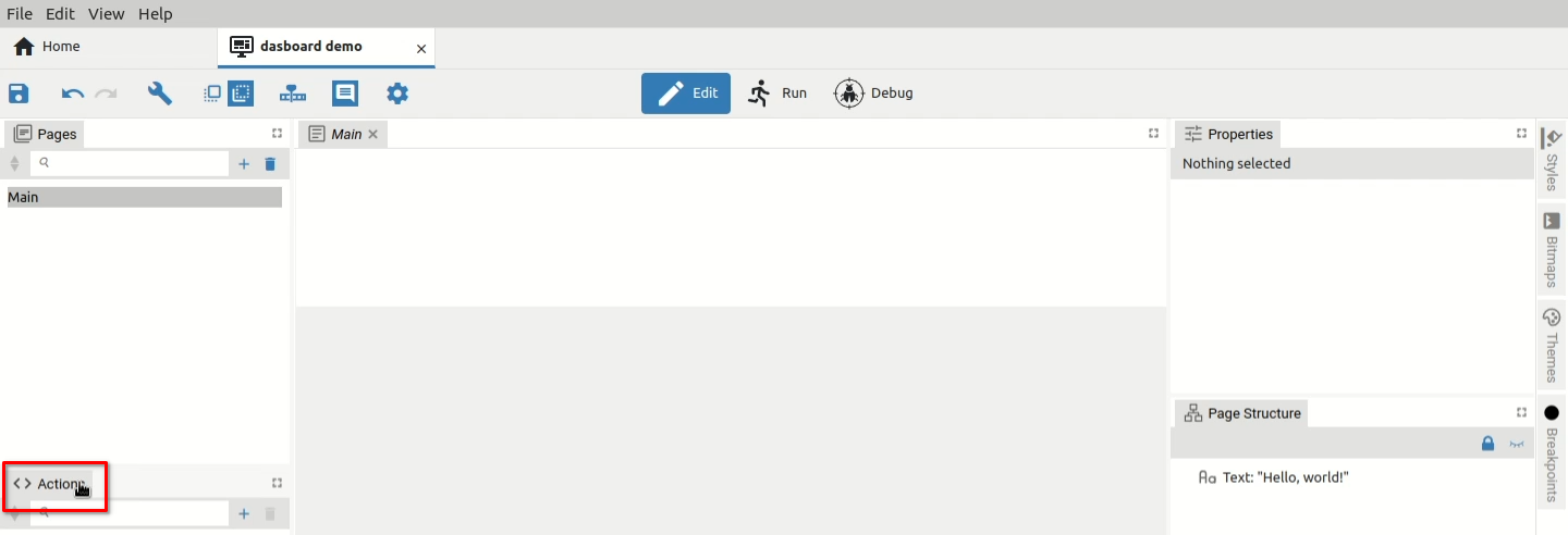
Fig. 3: Panel selection
The panel is now ready to move to another location. The cursor will change and marks will also appear on all four sides indicating the ability to dock into border tabsets (Fig. 4).
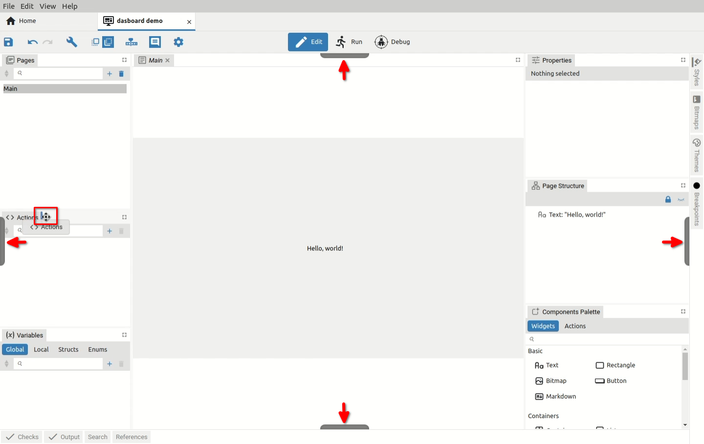
Fig. 4: Docking indicators for border tabs
Now we can choose where we want to dock the panel and whether we want it to become a new tab in the tabset or share the space occupied by an existing tabset. For example, if we want the selected panel to share horizontally the lower part of the space occupied by Pages, we will need to move the cursor to the lower part of the Pages panel when a rectangle will be displayed as in Fig. 5.
Similarly, if we want the selected panel to divide vertically the right part of the space occupied by Pages, we will need to move the cursor to the right part of the Pages panel until a rectangle is displayed as in Fig. 6.
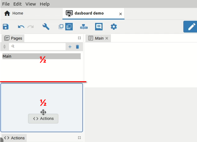 Fig. 5: Panel horizontal positioning
|
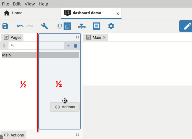 Fig. 6: Panel vertical positioning
|
The panel can also become a new tab within the existing tabset. This can be done in two ways: by moving the cursor next (left or right) to the existing tab in the tabset as shown in Fig. 7 or to place the cursor approximately in the middle of the existing tab so that a rectangle appears as in Fig. 8.
Note: if we move the cursor closer to the edges of the existing tab, smaller rectangles will appear indicating that the space of the existing tab will be split as shown in Fig. 5 and Fig. 6.
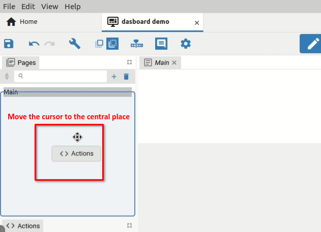 Fig. 7: Positioning in another tabset (1st method)
|
Fig. 8: Positioning in another tabset (2nd method)
|
Finally, when we have chosen where we want the selected panel to be displayed for docking, it will be necessary to release the mouse button. In our example, Actions will become a new tab in the tabset set with Pages (Fig. 9).
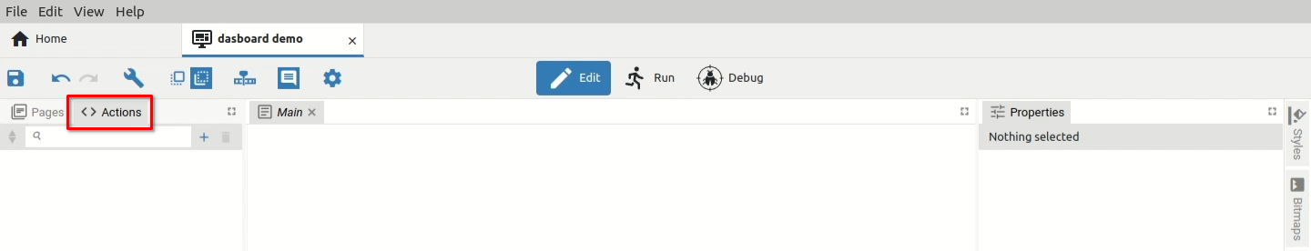
Fig. 9: Panel docking completed
P2.4. Border tabsets
Panels from border tabsets, unlike panels in the workspace, are displayed by clicking the tab (Fig. 10) and closed by clicking the tab again. Only one panel within a border tabset can be open at any time (Fig. 11).
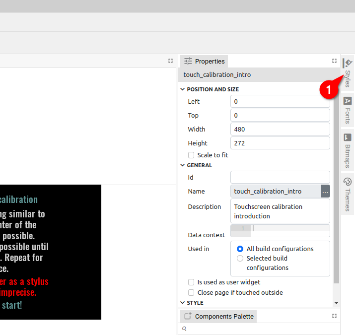 Fig. 10: Border tabs are closed
|
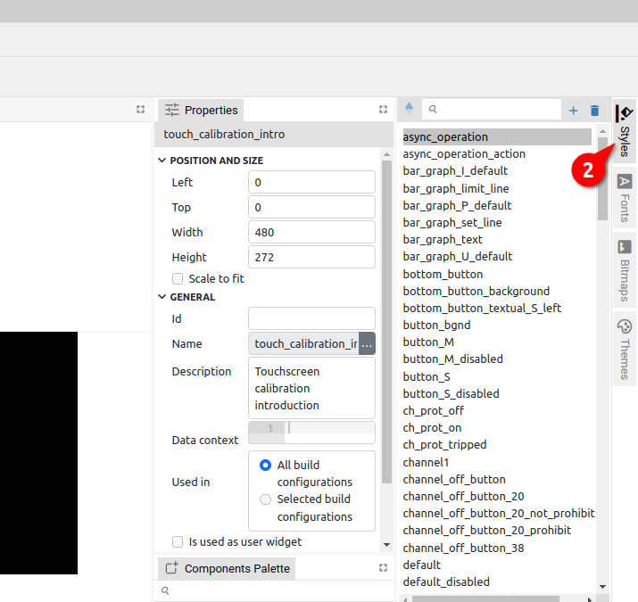 Fig. 11: The border tab is selected and opened
|
Panel docking is possible in Edit and Debug mode, but in Debug mode it is not possible to dock into border tabsets.