P7. Project editing
Designing the graphical layout of the page is possible by simple drag & drop of one or more Widgets from the Components palette. The first step is to click on the Widget and hold which will change the cursor (Fig. 1
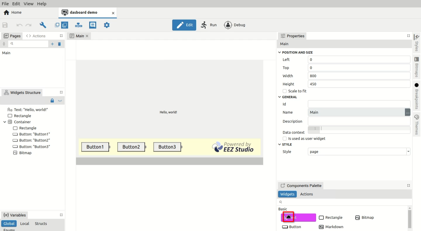
Fig. 1: Selection of Widget to add to the page
When the Widget is dragged into the editor area, auxiliary snap lines will appear immediately, which will make it easier to place the Widget in the desired place. Snap lines are displayed depending on nearby objects. If the position of the new Widget is not close enough to the others, or if it is the first Widget added to the page, the snap will be possible towards the page itself as in the examples in Fig. 2 where snap lines appear for horizontal or vertical centering.
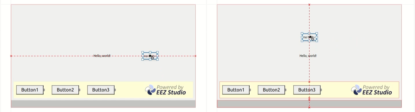
Fig. 2: Snap lines for centering in the page
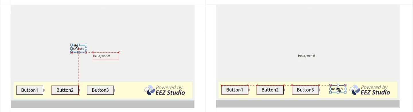
Fig. 3: Snap lines for positioning versus other Widgets
Fig. 3 shows examples of snap lines to the edges of other Widgets on the page.
In the event that snap lines become a nuisance during positioning for any reason, they can be disabled by holding down the SHIFT key while moving.
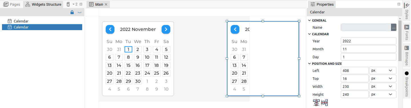
Fig. 4: Widget positioned outside the page
Please note that if the Widget in the EEZ-GUI and LVGL projects is set to protrude from the page (Fig. 4), the part that is outside the page will not be visible.
Widget positions can be freely changed and this can be done for one or more selected Widgets. It is possible to select multiple Widgets (Fig. 5): both in the page editor (1) or in the Page Structure panel (2). In both cases, information will appear in the Properties panel that multiple Widgets are selected (3). When selecting in the Page Structure panel, it is possible to use the SHIFT key to select a continuous sequence or CTRL to add individual Widgets to the selection.
There are two methods of multiple selection in the editor: selecting Widget by Widget while holding down the SHIFT key, and the second method is the so-called rubber band selection shown in Fig. 6 when selecting the area that will include the Widgets we want to select.
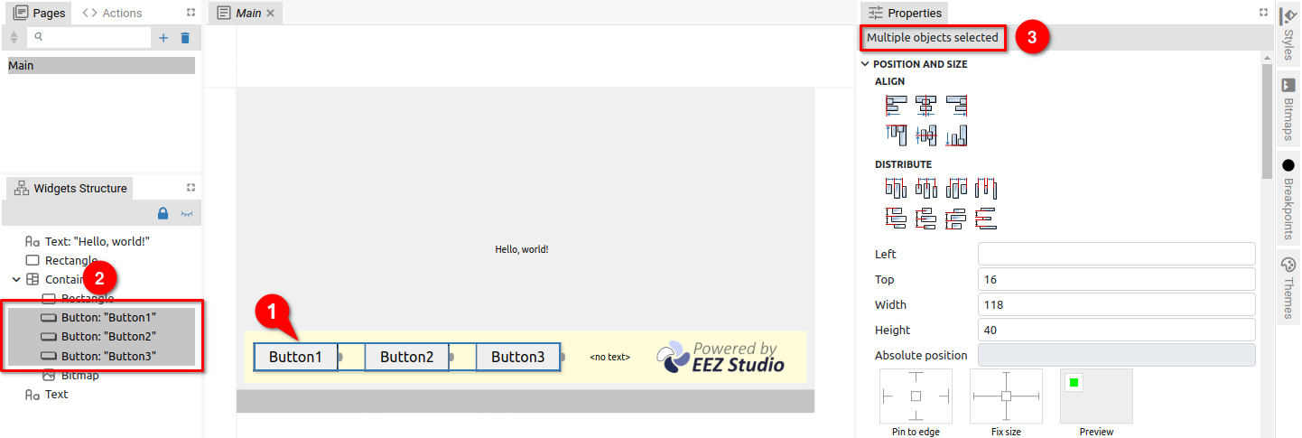
Fig. 5: Multiple Widgets selection
First you need to click on a place outside the Widget, then drag the mouse and release the button (a rectangle is displayed and when the mouse is released all Widgets inside will become selected).
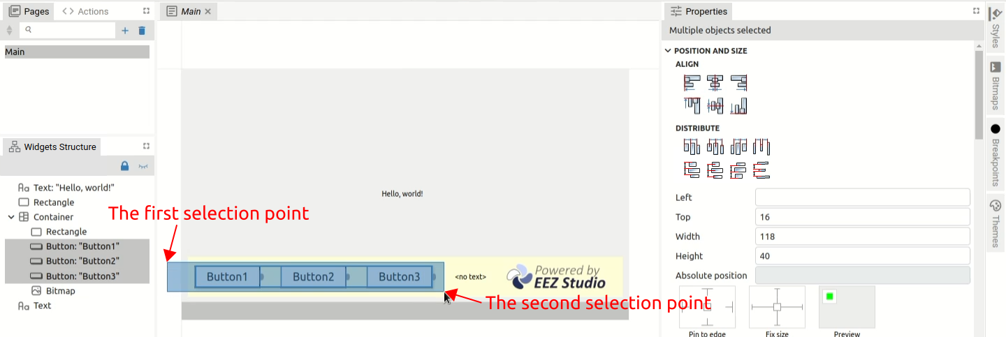
Fig. 6: "Rubber band" selection
As shown in Fig. 5, it is possible to change Properties for multiple Widgets. Specific to multiple selection is the Position and size section when the Align subsection gets more options, and a complete Distribute subsection appears.
The Distribute subsection will be enabled only if three or more Widgets are selected.
Align
|
Icon |
Title |
Description |

|
Align left edges |
Align to the left edge of the leftmost Widget. |

|
Center on vertical axis |
Vertical centering towards the center of the widest Widget. |

|
Align right edges |
Align to the right edge of the rightmost Widget. |

|
Align top edges |
Align to the top edge of the uppermost Widget. |

|
Center on horizontal axis |
Horizontal centering towards the center of the tallest Widget. |

|
Align bottom edges |
Align to the bottom edge of the lowest positioned Widget. |
Distribute
|
Icon |
Title |
Description |

|
Distribute left edges equidistantly |
Distribution of all Widgets between leftmost and rightmost Widgets for equal distance between left edges. |

|
Distribute centers equidistantly horizontally |
Distribution of all Widgets between leftmost and rightmost Widgets for equal distance between centers. |

|
Distribute right edges equidistantly |
Distribution of all Widgets between leftmost and rightmost Widgets for equal distance between right edges. |

|
Make horizontal gaps equal |
Distribution of all Widgets between leftmost and rightmost Widgets for an equal gap between them. |

|
Distribute top edges equidistantly |
Distribution of all Widgets between the uppermost and the lowest positioned Widget for equal distance between top edges. |

|
Distribute centers equidistantly vertically |
Distribution of all Widgets between the uppermost and the lowest positioned Widget for equal distance between centers.
|

|
Distribute bottom edges equidistantly |
Distribution of all Widgets between the uppermost and the lowest positioned Widget for equal distance between bottom edges. |

|
Make vertical gaps equal |
Distribution of all Widgets between the uppermost and the lowest positioned Widget for an equal gap between them. |
The page in the editor can be resized or set to the default size (1:1) or scrolled horizontally and vertically within the editor. For these operations, the mouse wheel is used in combination with the SHIFT and CTRL keys, as shown in Fig. 7.
|
Operation |
Description |
|
Page view resize |
CTRL + mouse wheel is used to zoom the page. |
|
Horizontal scroll |
SHIFT + mouse wheel is used for horizontal page scrolling. |
|
Vertical scroll |
The mouse wheel is used for vertical page scrolling. |
|
Move page |
The page can be moved with the middle or right mouse button. |
|
View reset |
Double-click resets the zoom and centers the page. |
|
Move Widget |
Drag and drop is used to move selected Widgets within the page. |
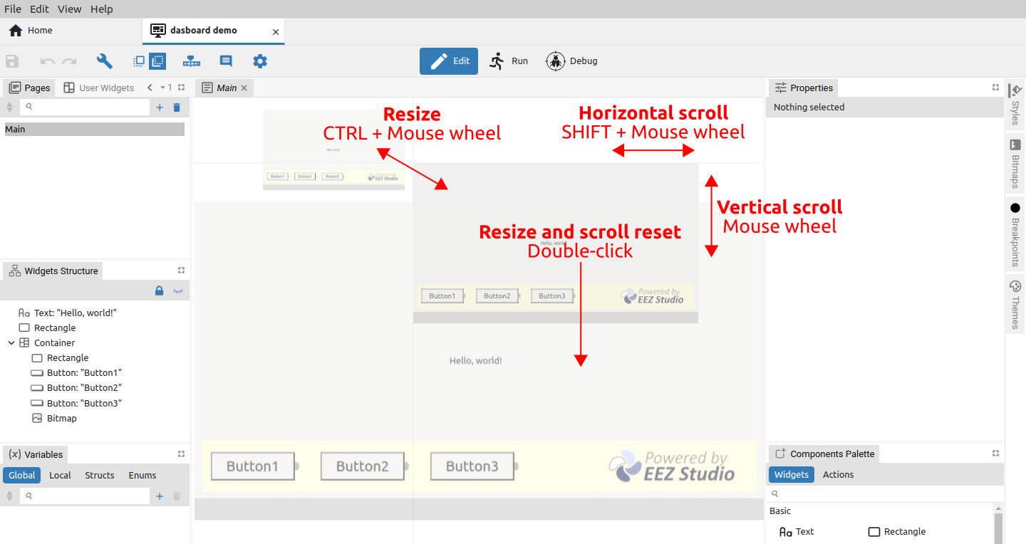
Fig. 7: Page resize and scroll
P7.1.1. Connecting Flow components
The connection (Flow line) between Flow components (Widgets and Actions) is used to define the flow of execution. In Fig. 2 shows how the output of one Action is connected to the input of another Action. When we position ourselves on the output (1), the color of its background will change, and if we continue with the mouse drag, the Flow line (2) will appear. When the cursor reaches the input of the second component, the Flow line will change color to green (3). Now we can release the mouse when the connection between the two components will be established (4). In case of moving one of the components, the Flow line will move with it.
To delete the Flow line, it will be necessary to select the Flow line (the color will change to red) and select the Delete option in the right-click menu (or the DEL key).
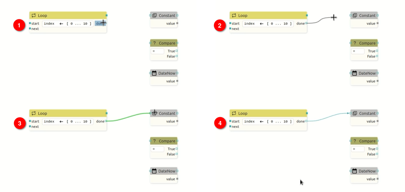
Fig. 8: Connecting the output to the input of the Widget
Adding a Flow line is also possible by starting from the input of one component to the output of another. In Fig. 9 shows how to connect the input of one Action to the output of another.
Note that it is possible to connect more than one Flow line to the single output, which also applies to the connection to the single input.
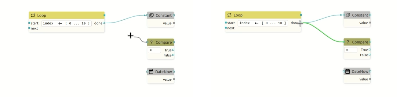
Fig. 9: Connecting the input to the output of the Widget
In case we have multiple Flow lines that end at a single input or output, it is possible to move them all to another input or output if necessary. Example in Fig. 10 shows the multiple Flow line moving from one output to another. First, we need to get to the output when the color of the background and all affected flow lines (1) will change. Then we need to drag the mouse while holding SHIFT, and a copy of the selected lines will appear, and their end can now be moved as desired (2). When we reach a new output, the color of the flow lines changes to green (3) and when the mouse button is released, a new connections will be drawn.
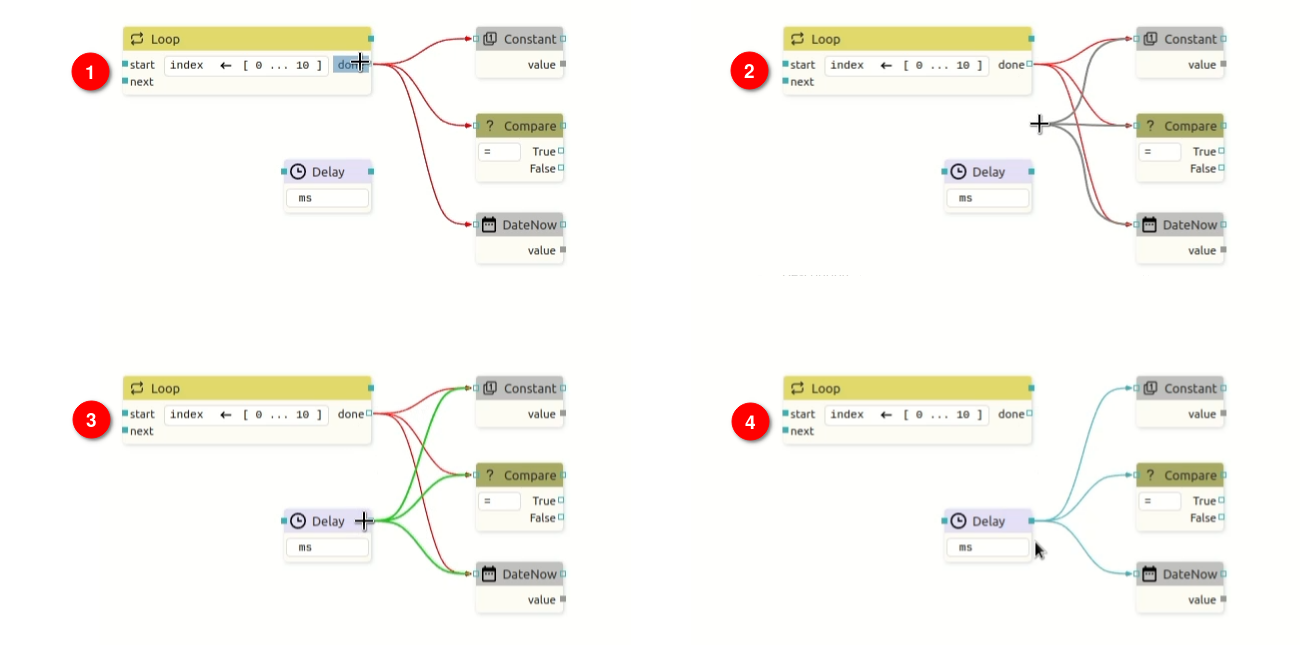
Fig. 10: Moving multiple connections
P7.1.2. Copy & Paste between two projects
To copy between two projects, it will be necessary to open two EEZ Studio windows using the New window (CTRL + SHIFT + N) option from the File menu. In the first project, select the section you want to copy and select the Copy option from the right-click menu (or CTRL + C) to copy to the clipboard. From the clipboard, the selected section can now be inserted into another project using the right-click menu Paste option (or CTRL + V).
P7.2. Working with Widgets
Widget components allow us to quickly add graphics to the page because each one implements a specific element (e.g. button, text, bitmap, QR code, etc.) that can be easily customized as needed.
Widgets are located in the Widgets subtab of the Components Palette, where they are grouped for easier finding.
EEZ Studio supports two types of Widgets that cannot be mixed with each other:
- EEZ-GUI (Native) – Widgets created for the purposes of creating the EEZ BB3 embedded GUI for the STM32 family of MCUs that support graphics (Fig. 11)
- LVGL – Widgets from the open-source embedded graphics library LVGL. They can only be used in a project of type LVGL. (Fig. 12)
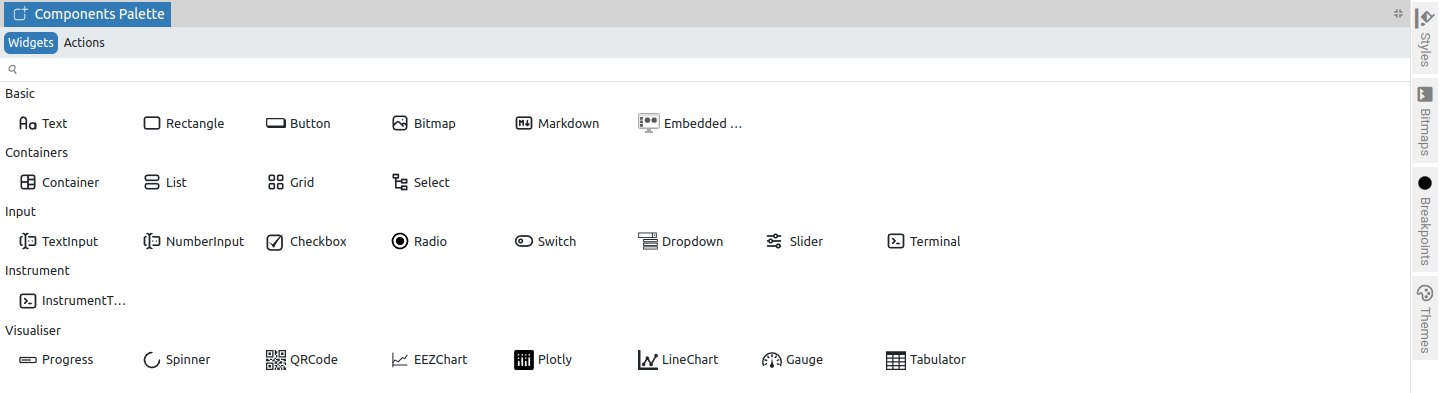
Fig. 11: Widgets palette for the EEZ-GUI project
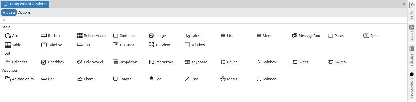
Fig. 12: Widgets palette for the LVGL project
P7.2.1. Widget component’s items
Widget component items are shown in Fig. 13 and described below.

Fig. 13: Widget components items
|
# |
Item |
Description |
|
1 |
Selection handlers |
They appear when the Widget is selected and allow it to be resized in all directions. |
|
2 |
Sequence Output |
The mandatory sequence output must be connected, otherwise it will generate an error as the Widget will not be able to perform correctly. |
|
3 |
Sequence Input |
The mandatory sequence input must be connected, otherwise it will generate an error since the Widget will not be able to perform correctly. |
|
4 |
Data Input |
The mandatory data input must be connected, otherwise it will generate an error as the Widget will not be able to perform correctly. |
|
5 |
Data Output |
The mandatory data output must be connected, otherwise it will generate an error as the Widget will not be able to perform correctly. |
Table 1 shows all types of I/O pins used as Flow line connection points for both Widgets and User Widgets.
|
Pin |
Description |

|
Sequence input pin (Flow line connection point). |

|
Sequence output pin. |

|
Data input pin. |

|
Data output pin. |
Table 1: User Widget’s pin types
P7.2.2. Creating a User Widget
The use of User Widgets contributes to modularity, which simplifies maintenance if the same layout elements appear in multiple places on the same or multiple pages. Each change will not need to be implemented in several places, but only in the User Widget.
A project can have an arbitrary number of User Widgets. User Widgets are displayed in the User Widgets panel, where new ones can be added and existing ones can be deleted.
A new User Widget can be created in two ways: using the User Widgets panel or the Right-click menu.
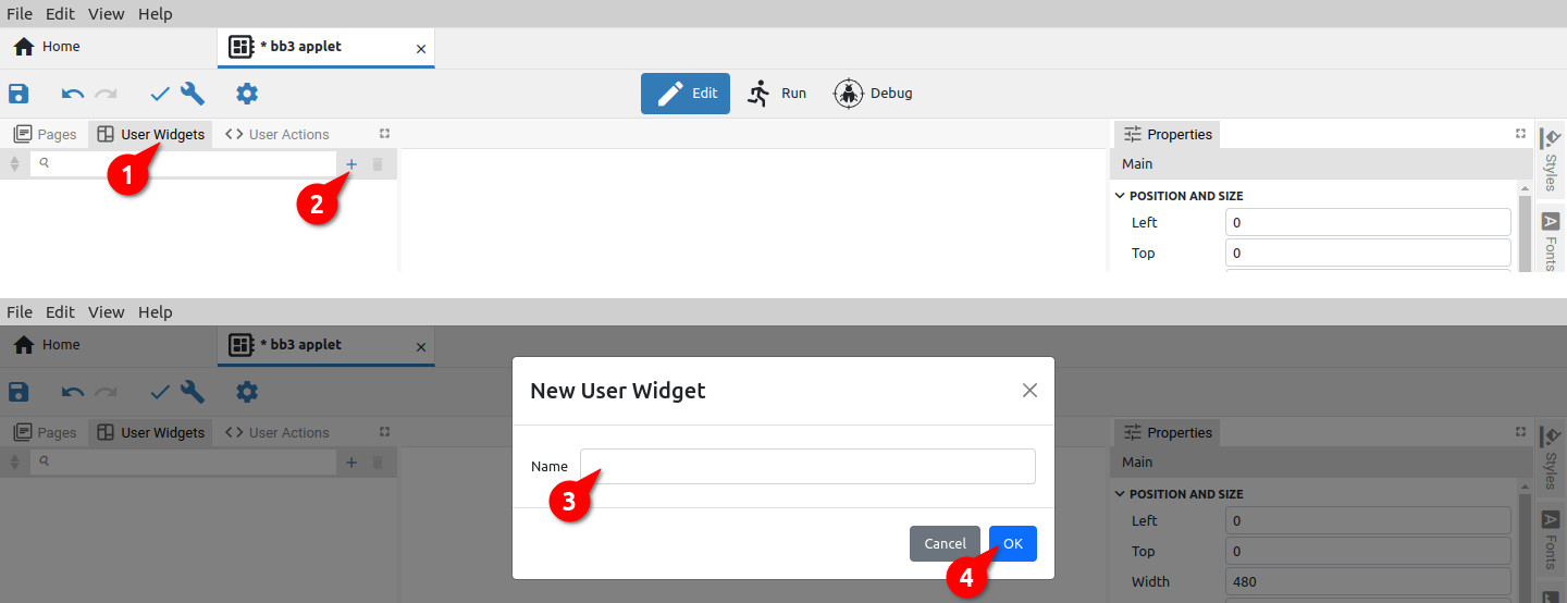
Fig. 14: Creating a new User Widget from the User Widgets panel
In the first case, select the User Widgets panel (1) and then the Add option (2), when a dialog box for entering the name of the User Widget will appear (Fig. 14).
After confirmation (4), the newly added User Widget will appear in the User Widgets list, where when selected, the editor opens where you can continue editing by adding Widgets and Actions.
A User Widget can also contain multiple User Widgets and User Actions.
User Widget added in this way will by default contain a page with dimensions defined in the general Settings of the project. In the example in Fig. that’s 480 x 272 pixels. It will also inherit the default style (hence the background is dark blue). The page will be positioned at the starting point (x = 0, y = 0).
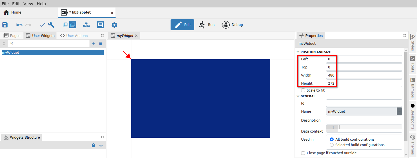
Fig. 15: Page editor of the newly created User Widget
User Widget can also be created by selecting one or more components on the currently displayed page (1) as shown on Fig. 16. By selecting the right-click menu option Create User Widget, a dialog box will appear as in the previous case (Fig. 14).
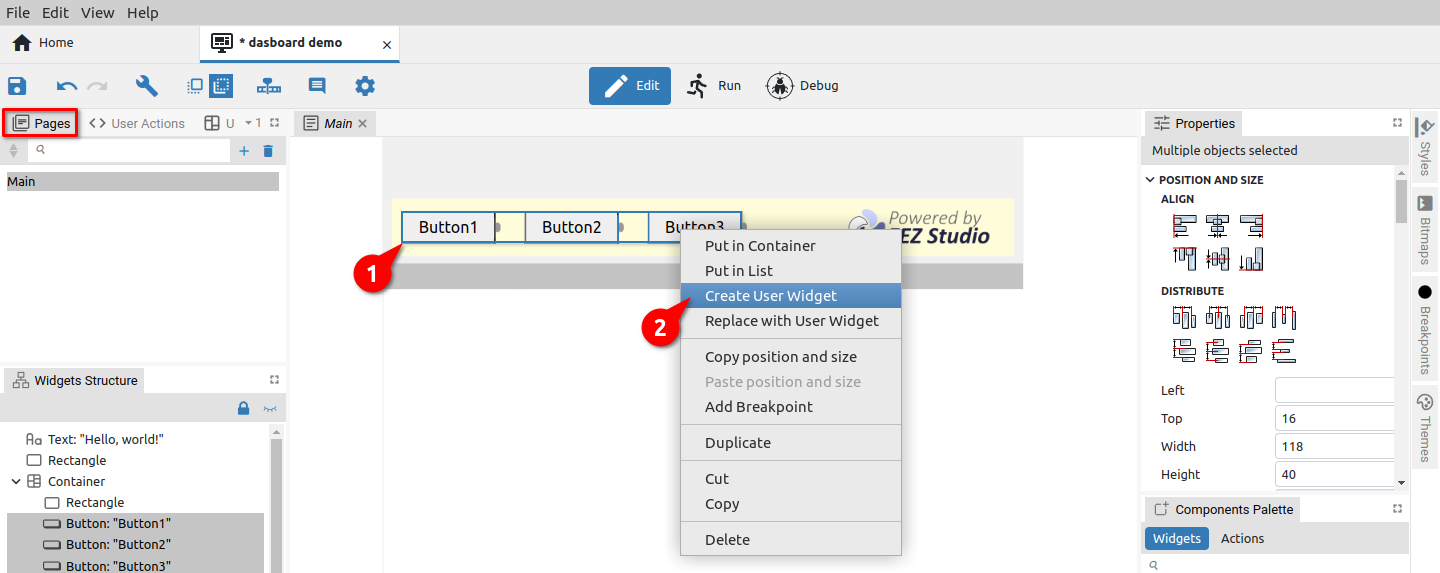
Fig. 16: Creating a new User Widget using the right-menu option
After successfully adding a new User Widget, it can be edited in the page editor (Fig. 17). Unlike the previous case, this Widget will have the dimensions of the original selection and the first component will be positioned at the starting point.
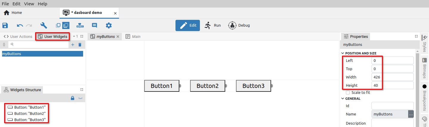
Fig. 17: The newly created User Widget in the editor
P7.3. Working with Actions
Action unlike Widget does not have a graphical representation. It only performs some function/operation when executed.
The Actions that come with EEZ Studio (i.e. built-in Actions) are located in the Actions subtab of Components Palette and are added to the editor with drag & drop and grouped for easy finding. The number of implemented Actions depends on the type of project. In Fig. 18 shows the Actions for the Dashboard project, and Fig. 19 for the LVGL project.
The Action can also be implemented in the EEZ Studio extension. An example of such an Action is Postgres, which is shown in the eez-Flow-ext-postgres group (Fig. 18).
EEZ Studio also allows defining User Actions. To edit them, we use the User Actions editor. All User Actions are also listed at the bottom of the Actions subtab (Fig. 19), from where they can be added to the project with drag and drop as any Action or Widget (1).
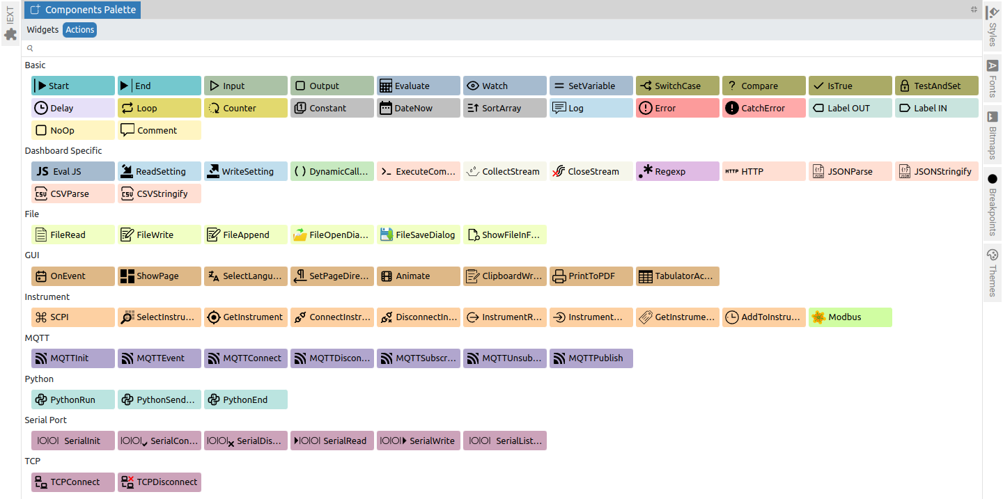
Fig. 18: Actions palette for the Dashboard project
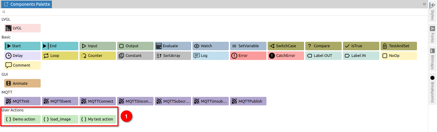
Fig. 19: Actions palette for the LVGL project
P7.3.1. Action component’s items
Action component items are shown in Fig. 20 and described below.
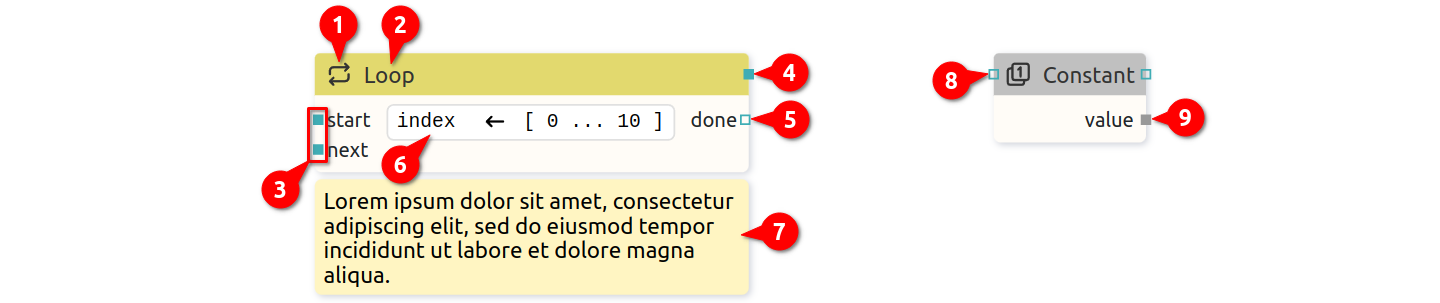
Fig. 20: Action components items
|
# |
Item |
Description |
|
1 |
Icon |
Component icon (cannot be changed). |
|
2 |
Name |
Component name (cannot be changed). |
|
3 |
Mandatory sequence inputs |
The mandatory sequence input must be connected, otherwise it will generate an error since the component will not be able to perform correctly. |
|
4 |
Mandatory sequence output |
The mandatory sequence input must be connected, otherwise it will generate an error as the Action will not be able to perform correctly. |
|
5 |
Optional sequence output |
Sequence output that does not necessarily need to be connected for the Action to execute regularly. |
|
6 |
Additional information |
Optional display of additional Action component information. |
|
7 |
Description |
Component description as defined in Properties. |
|
8 |
Optional sequence input |
Sequence input that does not necessarily need to be connected for the Action to execute regularly. |
|
9 |
Mandatory data output |
The mandatory data input must be connected, otherwise it will generate an error as the Action will not be able to perform correctly. |
Table 2 shows all types of I/O pins used as Flow line connection points for both Actions and User Actions.
|
Pin |
Description |

|
Mandatory sequence input or output pin (Flow line connection point). |

|
Optional sequence input or output pin. |

|
Mandatory data input or output pin. |

|
Optional data input or output pin. |
Table 2: Action’s pin types
P7.3.2. Creating a User Action
Using User Actions contributes to Flow’s readability and modularity, which makes it easier to maintain if the same functionality appears in multiple places. Thus, each change will not need to be implemented in multiple places, but only in the User Action.
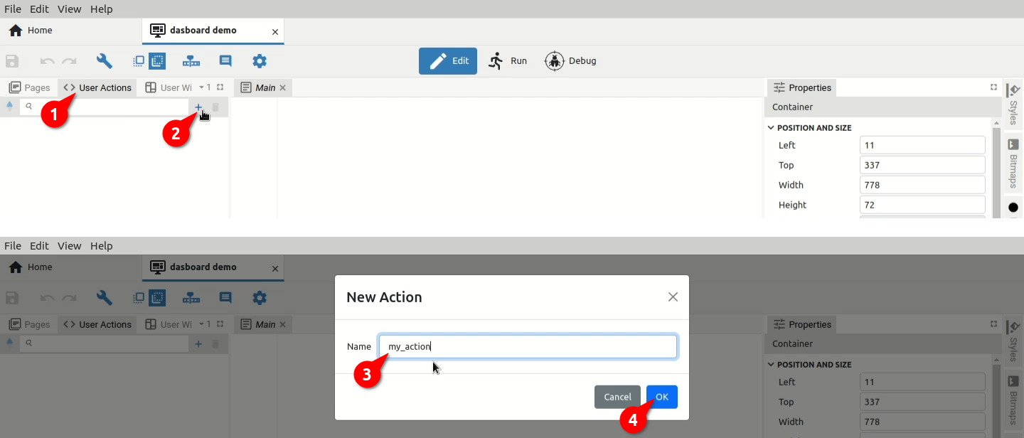
Fig. 21: Creating a new User Action
Please note that adding a User Action to itself is also allowed. However, care should be taken that it is connected in such a way that it does not create an infinite loop during execution.
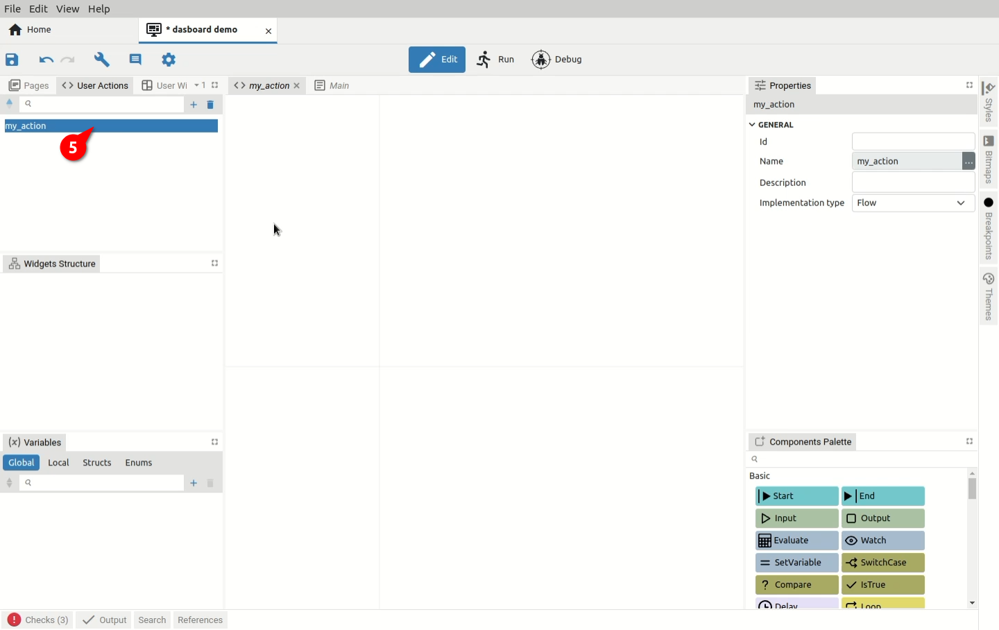
Fig. 22: Flow editor of the newly created User Action
Fig. 23 shows several examples of User Actions and how the use of sequence and data flow lines affects the appearance of the components that will be displayed in the Action palette.
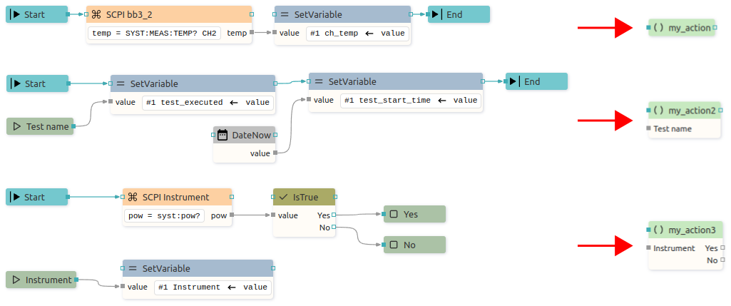
Fig. 23: User Action examples