Scale
Description
Scale allows you to have a linear scale with ranges and sections with custom styling.
Properties
Specific
-
Scale mode
Enum
-
Defines position and orientation of the scale.
-
Min value
EXPRESSION (integer)
-
The minimum value of the scale range.
-
Min value type
Enum
-
Defines whether the
Min valuewill be given as a Literal or as an Expression. -
Max value
EXPRESSION (integer)
-
The maximum value of the scale range.
-
Max value type
Enum
-
Defines whether the
Max valuewill be given as a Literal or as an Expression. -
Angle range
Number
-
The angular span of the scale in degrees. For example,
270means the scale spans 270 degrees. -
Rotation
EXPRESSION (integer)
-
An offset to the 0 degree position, in degrees.
-
Rotation type
Enum
-
Defines whether the
Rotationwill be given as a Literal or as an Expression. -
Total tick count
Number
-
Set the number of total ticks.
-
Major tick every
Number
-
Configure the major tick being every Nth ticks.
-
Post draw
Boolean
-
If enabled, the scale is drawn after the children are drawn. This can be useful when the scale has needles as children and the scale should be drawn on top of the needles.
-
Draw ticks on top
Boolean
-
If enabled, the ticks are drawn on top of the main line or arc.
-
Show labels
Boolean
-
Set to true if labels should be drawn.
-
Label texts
MultilineText
-
Comma-separated list of custom label texts to use instead of the auto-generated numeric labels.
-
Main styles
Any
-
Section header for the main line/arc style properties.
-
Main line width
Number
-
The width of the main line in pixels. Only visible for straight scale modes (
HORIZONTAL_TOP,HORIZONTAL_BOTTOM,VERTICAL_LEFT,VERTICAL_RIGHT). -
Main line color
ThemedColor
-
The color of the main line. Only visible for straight scale modes.
-
Main line opacity
Number
-
The opacity of the main line (0-255). Only visible for straight scale modes.
-
Main arc width
Number
-
The width of the main arc in pixels. Only visible for round scale modes (
ROUND_INNER,ROUND_OUTER). -
Main arc color
ThemedColor
-
The color of the main arc. Only visible for round scale modes.
-
Main arc opacity
Number
-
The opacity of the main arc (0-255). Only visible for round scale modes.
-
Main arc rounded
Boolean
-
If enabled, the ends of the main arc are rounded. Only visible for round scale modes.
-
Main arc image
ObjectReference
-
A bitmap to use as the main arc image source. Only visible for round scale modes.
-
Minor ticks styles
Any
-
Section header for the minor ticks style properties.
-
Minor ticks length
Number
-
The length of the minor ticks in pixels.
-
Minor ticks width
Number
-
The width of the minor ticks in pixels.
-
Minor ticks color
ThemedColor
-
The color of the minor ticks.
-
Minor ticks opacity
Number
-
The opacity of the minor ticks (0-255).
-
Major ticks styles
Any
-
Section header for the major ticks style properties.
-
Major ticks length
Number
-
The length of the major ticks in pixels.
-
Major ticks width
Number
-
The width of the major ticks in pixels.
-
Major ticks color
ThemedColor
-
The color of the major ticks.
-
Major ticks opacity
Number
-
The opacity of the major ticks (0-255).
-
Labels styles
Any
-
Section header for the labels style properties.
-
Labels text color
ThemedColor
-
The color of the label texts.
-
Labels text opacity
Number
-
The opacity of the label texts (0-255).
-
Labels text font
Enum
-
The font used for the label texts. Can be a built-in LVGL font or a custom font defined in the project.
-
Sections
Array
-
A list of scale sections. Each section defines a range of the scale with custom styling. Sections can have their own min/max values, and custom styles for the main line/arc, minor ticks, major ticks, and labels within that range. A style created for the Scale widget can also be assigned to a section via the
Use styleproperty.
General
-
Name
String
-
Widget name. We reference the Widget within the project by its name, for example in the LVGL action. For each Widget, we must choose a unique name within the entire project. This field is optional and does not need to be set if we do not need to reference the Widget.
-
Group
ObjectReference
-
The name of the input group this widget belongs to.
-
Group index
Number
-
Defines the order of widgets within group. This is similar to tabindex in HTML:
- if “Group index” is 0 then group order is the same as in Widgets Structure
- if “Group index” is > 0 then widget is added to the group before any widget with “Group index” 0 and before any widget with the greater “Group index” value. That is, “Group index”=4 is added before “Group index”=5 and “Group index”=0, but after “Group index”=3. If multiple widgets share the same “Group index” value, their order relative to each other follows their position in the Widgets Structure.
Position and size
-
Left
Number
-
X position of the component in relation to the page or parent widget. It is set in pixels.
Hint: when setting the value of this property (as well as the
Top,WidthandHeightproperties), simple mathematical expressions can be used. When we enter an expression and press enter, the expression will be evaluated and the result set as the value of this property. It is allowed to use+,-,*and/operators in expressions. Brackets can also be used.Examples of such mathematical expressions:
18 + 36,50 + 32 * 6,(100 - 32) / 2. -
Left unit
Enum
-
The following options are available:
px– Left is default in pixels.%– Left is set as a percentage in relation to the parent width.
-
Top
Number
-
Y position of the component in relation to the page or parent widget. It is set in pixels.
-
Top unit
Enum
-
The following options are available:
px– Top is set in pixels.%– The top is set as a percentage in relation to the parent height.
-
Width
Number
-
The width of the component. It is set in pixels.
-
Width unit
Enum
-
The following options are available:
px– Width is given in pixels.%– Width is given as a percentage in relation to the parent width.content– Width is automatically set to fit the entire content in width.
-
Height
Number
-
The height of the component. It is set in pixels.
-
Height unit
Enum
-
The following options are available:
px– Height is given in pixels.%– Height is given as a percentage in relation to the parent height.content– Height is automatically set to fit the entire content in height.
-
Absolute pos.
String
-
The absolute position of the component in relation to the page. This property is read-only.
-
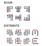
Align and distribute
Any
-
Alignment icons and component distribution. Alignment icons appear when two or more components are selected, and distribution icons appear when three or more components are selected.
-
Center widget
Any
-
Icons for horizontal and vertical centering of widgets within a page or parent widget.

Layout
-
Tab title
EXPRESSION (string)
-
If this widget is a child of a container with layout set to
Docking Manager, use this property to set the title of the tab that contains this widget.
Style
-
Use style
ObjectReference
-
Here we can select one of the globally defined Styles so that the Widget uses that Style.
Flags
-
Hidden
EXPRESSION (boolean)
-
Make the object hidden.
-
Hidden flag type
Enum
-
Here we can choose whether the
Hiddenflag state will be calculated from the Expression or not. -
Clickable
EXPRESSION (boolean)
-
Make the object clickable by input devices.
-
Clickable flag type
Enum
-
Here we can choose whether the
Clickableflag state will be calculated from the Expression or not. -
Click focusable
Boolean
-
Add focused state to the object when clicked.
-
Checkable
Boolean
-
Toggle checked state when the object is clicked.
-
Scrollable
Boolean
-
Make the object scrollable.
-
Scroll elastic
Boolean
-
Allow scrolling inside but with slower speed.
-
Scroll momentum
Boolean
-
Make the object scroll further when “thrown”.
-
Scroll one
Boolean
-
Allow scrolling only one snappable children.
-
Scroll chain hor
Boolean
-
Allow propagating the horizontal scroll to a parent.
-
Scroll chain ver
Boolean
-
Allow propagating the vertical scroll to a parent.
-
Scroll on focus
Boolean
-
Automatically scroll object to make it visible when focused.
-
Scroll with arrow
Boolean
-
Allow scrolling the focused object with arrow keys.
-
Snappable
Boolean
-
If scroll snap is enabled on the parent it can snap to this object.
-
Press lock
Boolean
-
Keep the object pressed even if the press slid from the object.
-
Event bubble
Boolean
-
Propagate the events to the parent too.
-
Gesture bubble
Boolean
-
Propagate the gestures to the parent.
-
Adv hittest
Boolean
-
Allow performing more accurate hit (click) test. E.g. accounting for rounded corners.
-
Ignore layout
Boolean
-
Make the object positionable by the layouts.
-
Floating
Boolean
-
Do not scroll the object when the parent scrolls and ignore layout.
-
Overflow visible
Boolean
-
Do not clip the children’s content to the parent’s boundary.
-
Scrollbar mode
Enum
-
Scrollbars are displayed according to a configured mode. The following mode(s) exist:
- OFF: Never show the scrollbars
- ON: Always show the scrollbars
- ACTIVE: Show scroll bars while an object is being scrolled
- AUTO: Show scroll bars when the content is large enough to be scrolled
-
Scroll direction
Enum
-
Controls the direction in which scrolling happens. The following mode(s) exist:
- NONE: no scroll
- TOP: only scroll up
- LEFT: only scroll left
- BOTTOM: only scroll down
- RIGHT: only scroll right
- HOR: only scroll horizontally
- VER: only scroll vertically
- ALL: scroll any directions
-
Scroll snap X
Enum
-
The children of an object can be snapped according to specific rules when scrolling ends.
An object can align snapped children in four ways:
- NONE: Snapping is disabled. (default)
- START: Align the children to the left side of a scrolled object
- END: Align the children to the right side of a scrolled object
- CENTER: Align the children to the center of a scrolled object
-
Scroll snap Y
Enum
-
The children of an object can be snapped according to specific rules when scrolling ends.
An object can align snapped children in four ways:
- NONE: Snapping is disabled. (default)
- START: Align the children to the top side of a scrolled object
- END: Align the children to the bottom side of a scrolled object
- CENTER: Align the children to the center of a scrolled object
States
-
Checked
EXPRESSION (boolean)
-
Toggled or checked state.
-
Checked state type
Enum
-
Here we can choose whether the
Checkedstate will be calculated from the Expression or not. -
Disabled
EXPRESSION (boolean)
-
Disabled state
-
Disabled state type
Enum
-
Here we can choose whether the
Disabledstate will be calculated from the Expression or not. -
Focused
Boolean
-
Focused via keypad or encoder or clicked via touchpad/mouse.
-
Focus key
Boolean
-
Focused via keypad or encoder but not via touchpad/mouse
-
Pressed
Boolean
-
Being pressed.
Events
-
Event handlers
Array
-
List of event handler definitions. During execution, the widget can generate certain events (e.g. the
CLICKEDevent is generated when the touchscreen is pressed and released within the Widget) and through this list we can specify the method of event processing. We must define these properties for each event handler:Event– Event that is processed, e.g.CLICKED.Handler type– There are two options:FloworAction. IfFlowis selected, a flow output will be added through which the event is processed, and ifActionis selected, then it is necessary to specify which User action will be performed during event processing.Action– If theHandler typeis set toAction, then here we need to enter the name of the User action that will be performed during the processing of the selected event.
Flow
-
Inputs
Array
-
Additional component inputs that the user can add as desired in order to use them to receive additional data needed when evaluating expressions in properties. Each input is given a name and type. Name is used when referencing an input within an expression. A type is used to project Check to check whether a data line that transmits data of that type is connected to the input or not.
-
Outputs
Array
-
Additional component outputs that the user can add to send data through. Each output is assigned a name and type. An example of using this output is e.g. in the Loop component, where we can put the output name for the
Variableproperty instead of e.g. variable name. In that case, the Loop component will not change the content of the variable in each step, but will send the current value through that output. -
Catch error
Boolean
-
If this checkbox is enabled then an
@Erroroutput will be added to the component and if an error occurs in this component during the execution of the Flow, the Flow will continue through that output. The data that will be passed through that output is the textual description of the error.
Examples
- Scale